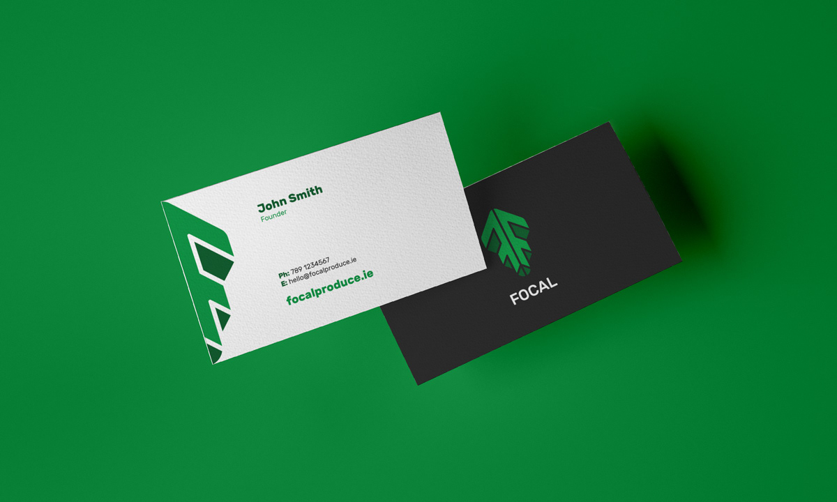
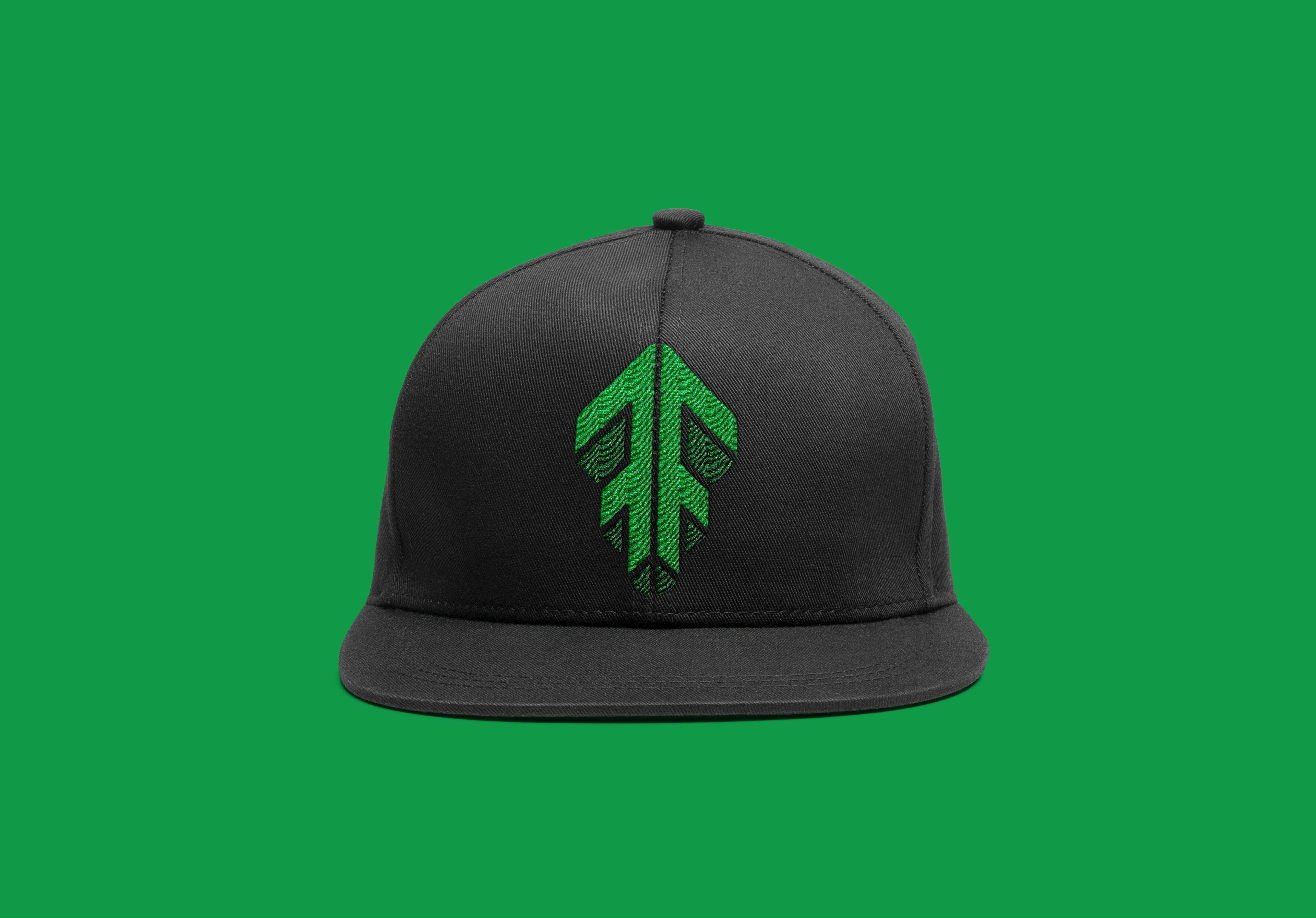
Focal is a young vertical farming company based in Ireland. When starting out, they hired me to design their logo. At the time the company was not married to the name 'Focal', so they asked me to also present one option with a different name. In total, I designed three logos - two to go alongside the 'Focal' name and one to go alongside the name 'Stacked'. Ultimately the logo that was chosen is the first below.
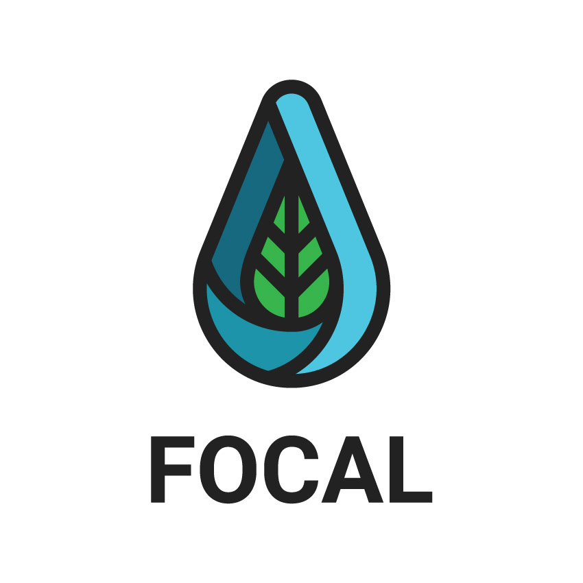
This concept was made entirely with the natural elements of vertical farming in mind. Since vertical farming relies so much less on the likes of pesticides and chemicals for growth than traditional farming, I wanted to focus in on that aspect for this design.
The outer shape resembles that of a water droplet, vital to the growth of produce, represented by the green leaf on the inside of the logo. The entire logo mark represents these aspects of vertical farming working together in harmony.
The water droplet is divided into three sections, gradually darkening as the eye follows around the shape. The idea behind this decision was to allude to one of the biggest benefits of vertical farming - the verticality and the different layers that save on real estate over traditional farming.


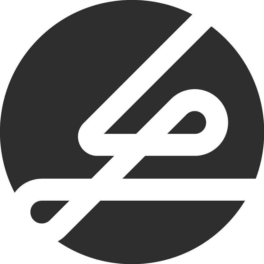
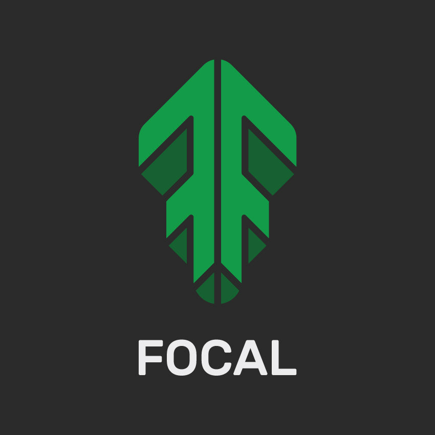
This concept came from initial sketches based around a capital letter ‘F’. I wanted to tie the letter that represents the company name together with a logo mark that represents the company.
The ‘F’ in the logo mark is reflected backwards, creating an upward pointing arrow. This represents both the verticality of vertical farming, as well as the natural growth of the produce.
The darkened sections of the logo that form the ‘3D’ perspective, also allude to the stacking of the produce grown in vertical farms.
The shades of green evoke a sense of nature, growth and health, which is accentuated by the rounded ends of the ‘arrow’ shape, giving the entire logo a soft and natural feel.


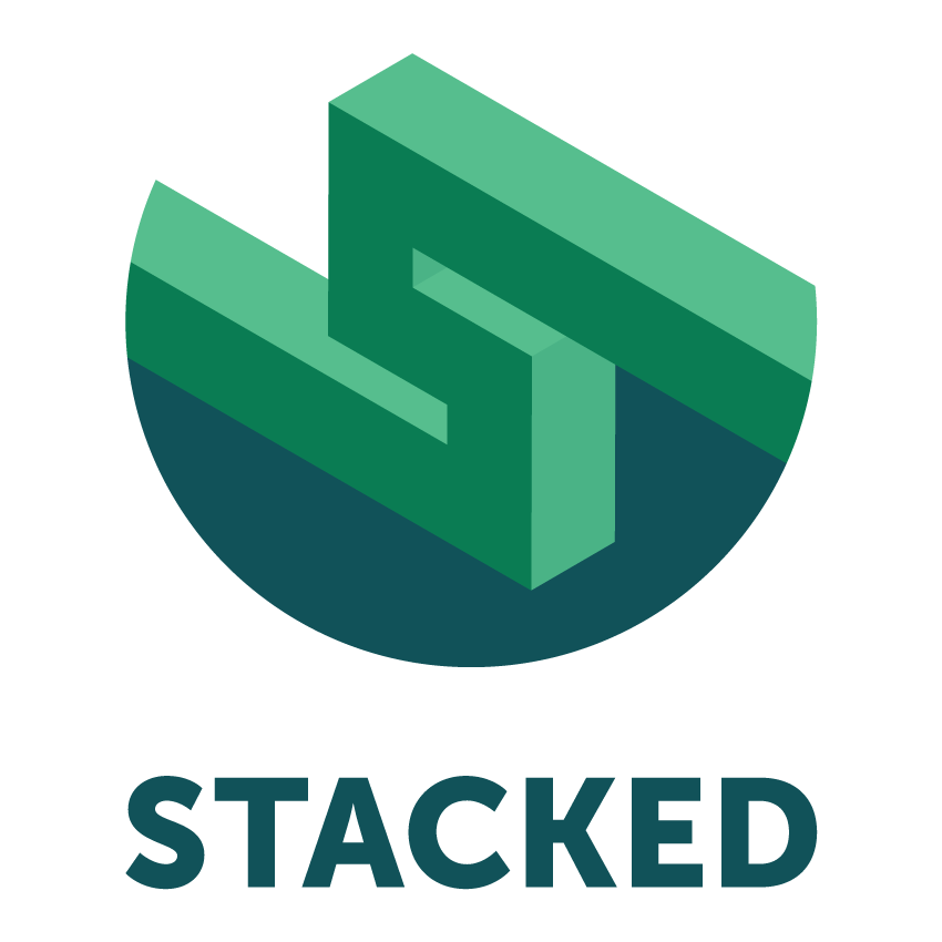
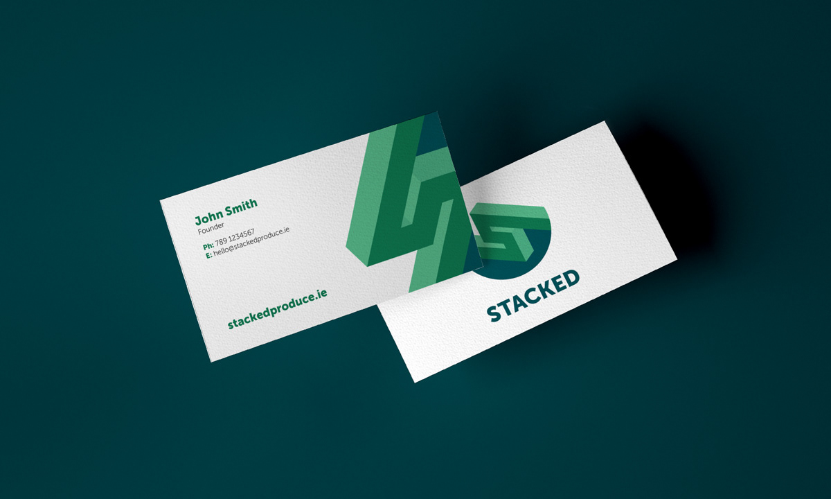
This final concept came from my own idea for the company name - ‘Stacked’. The idea behind the name is to make the viewer picture the vertical aspect behind the industry. ‘Stacked’ represents the stacking of the different layers in a vertical farm.
The idea behind the logo concept was to create a visual representation of the balance and harmony between the mechanical and natural aspects of vertical farming. We have the sharp, geometric lines and edges of the top half of the logo, complimented by the natural circular bottom half.
The isometric-view, 3D ‘S’ shape represents the name of the company and also adds a mechanical feel to the overall design of the logo. Shades of green and blue loosely allude to the natural colours of water and produce.